
Project Warmhug
From strategy to story, our work speaks for itself. We partner with brands to create thoughtful branding and design solutions that build strong identities and real impact, and we have the portfolio to prove it.
Packaging Design
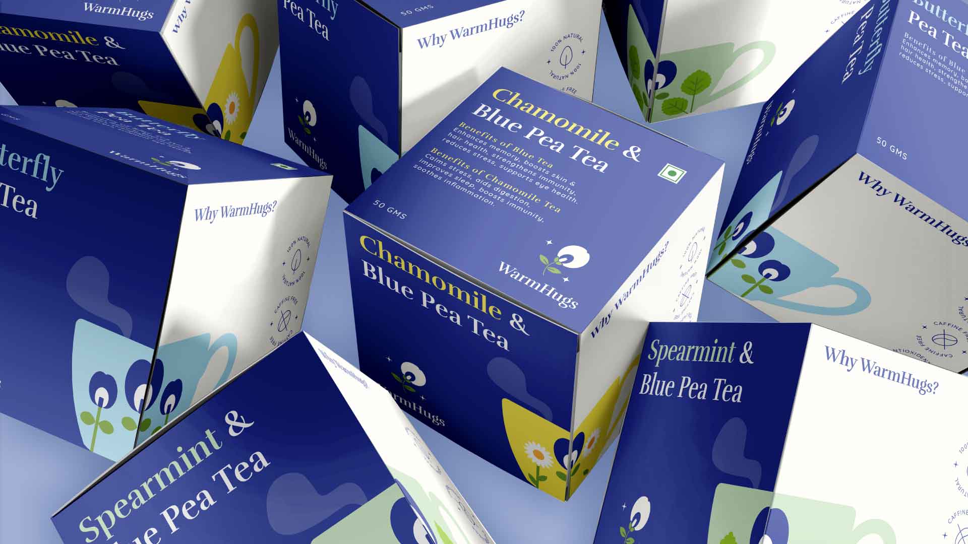
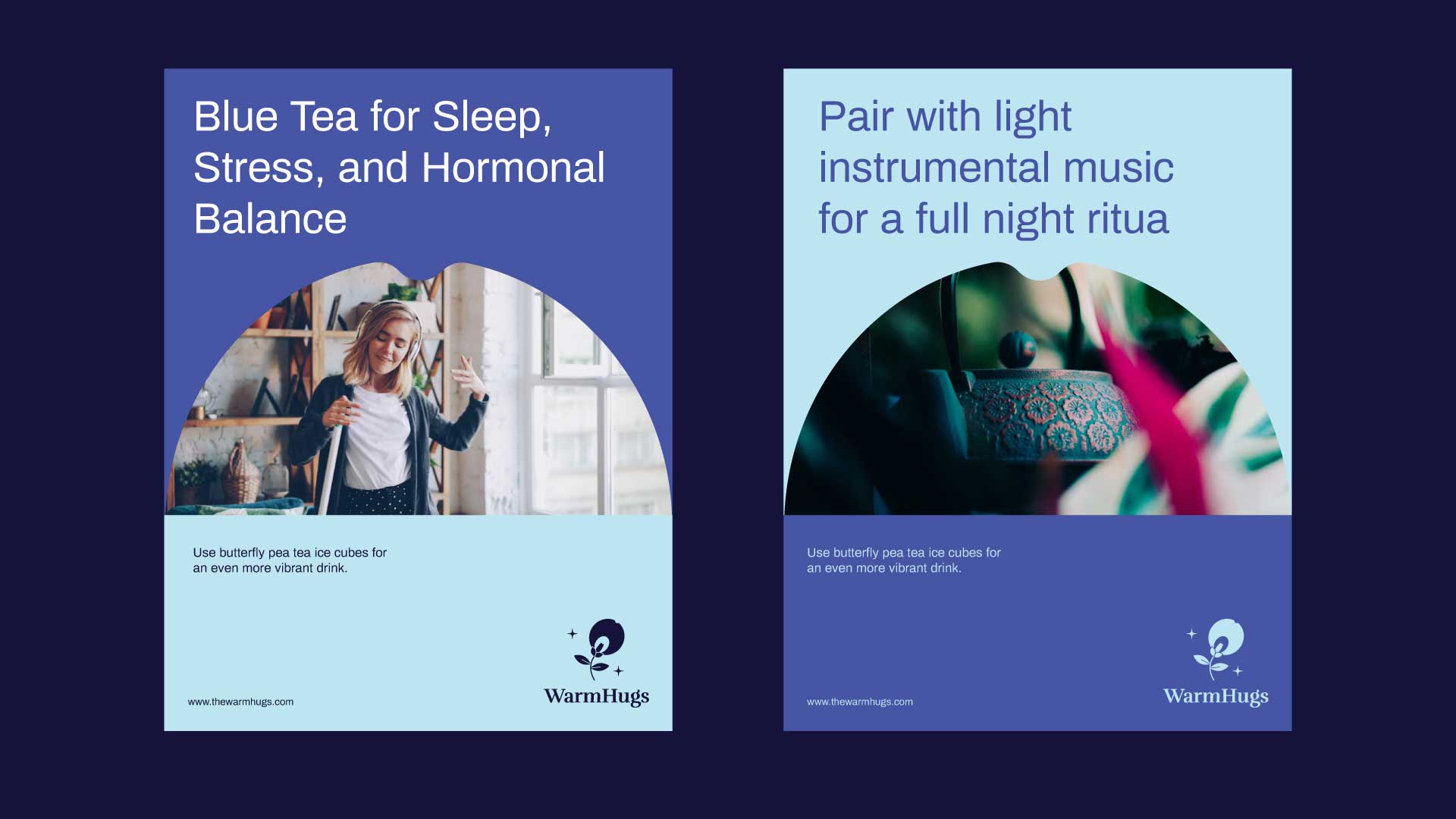
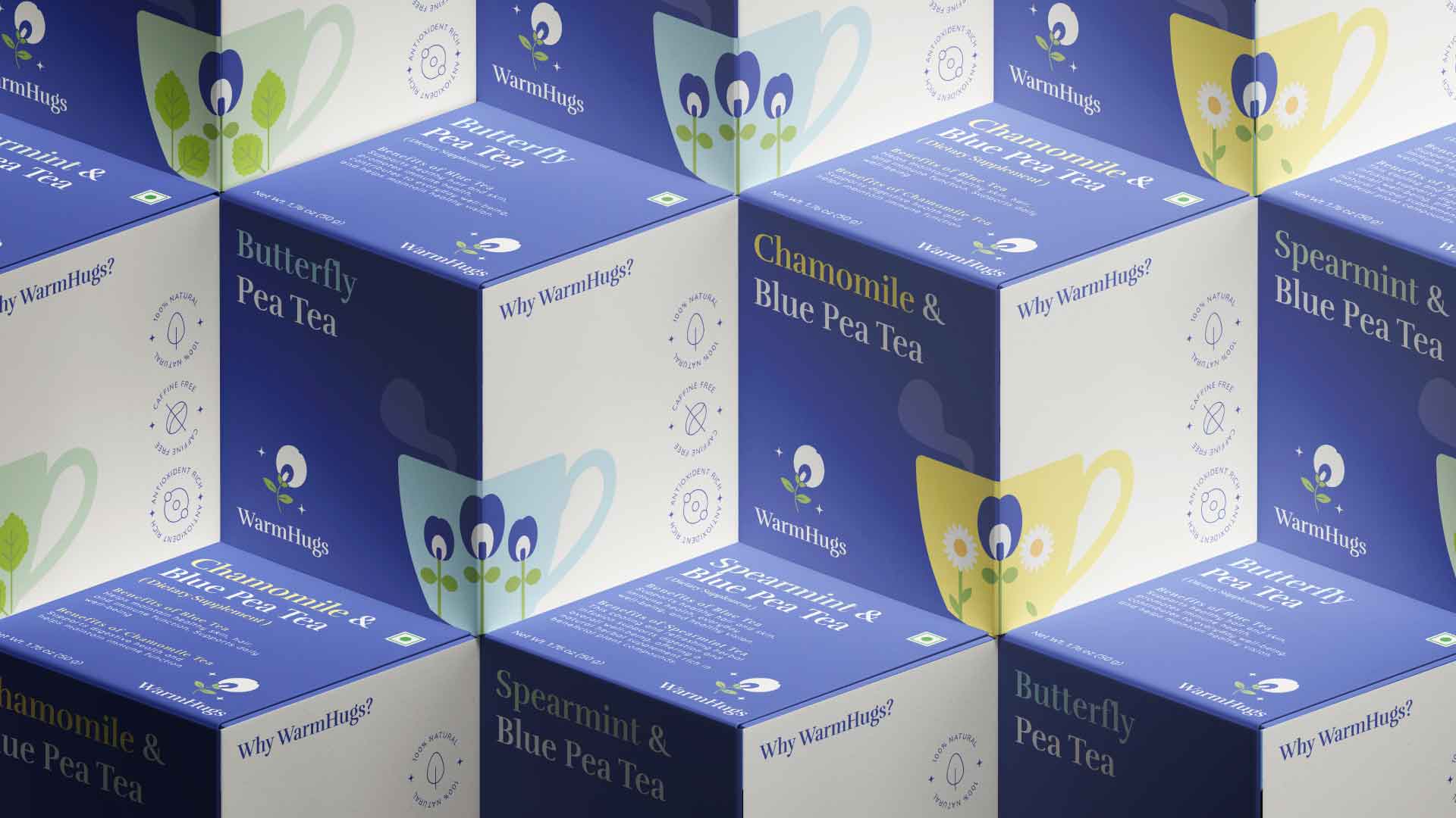
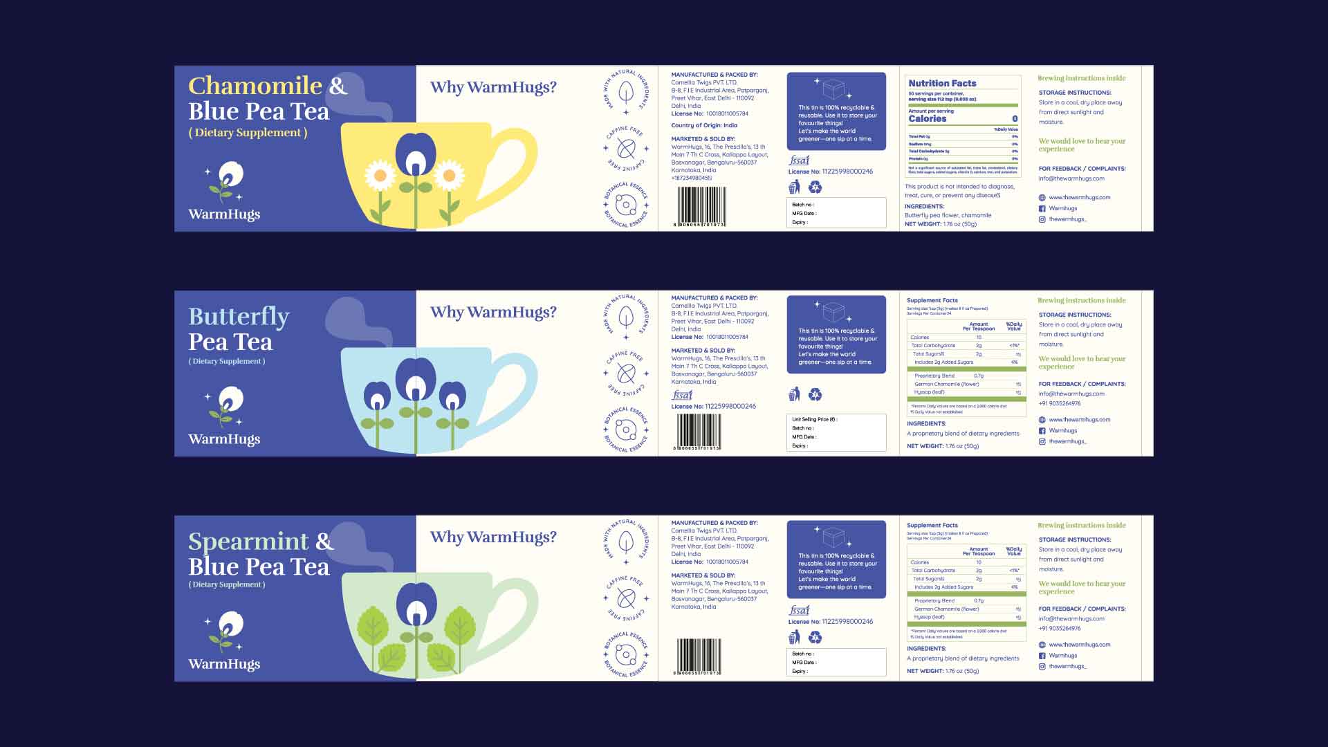
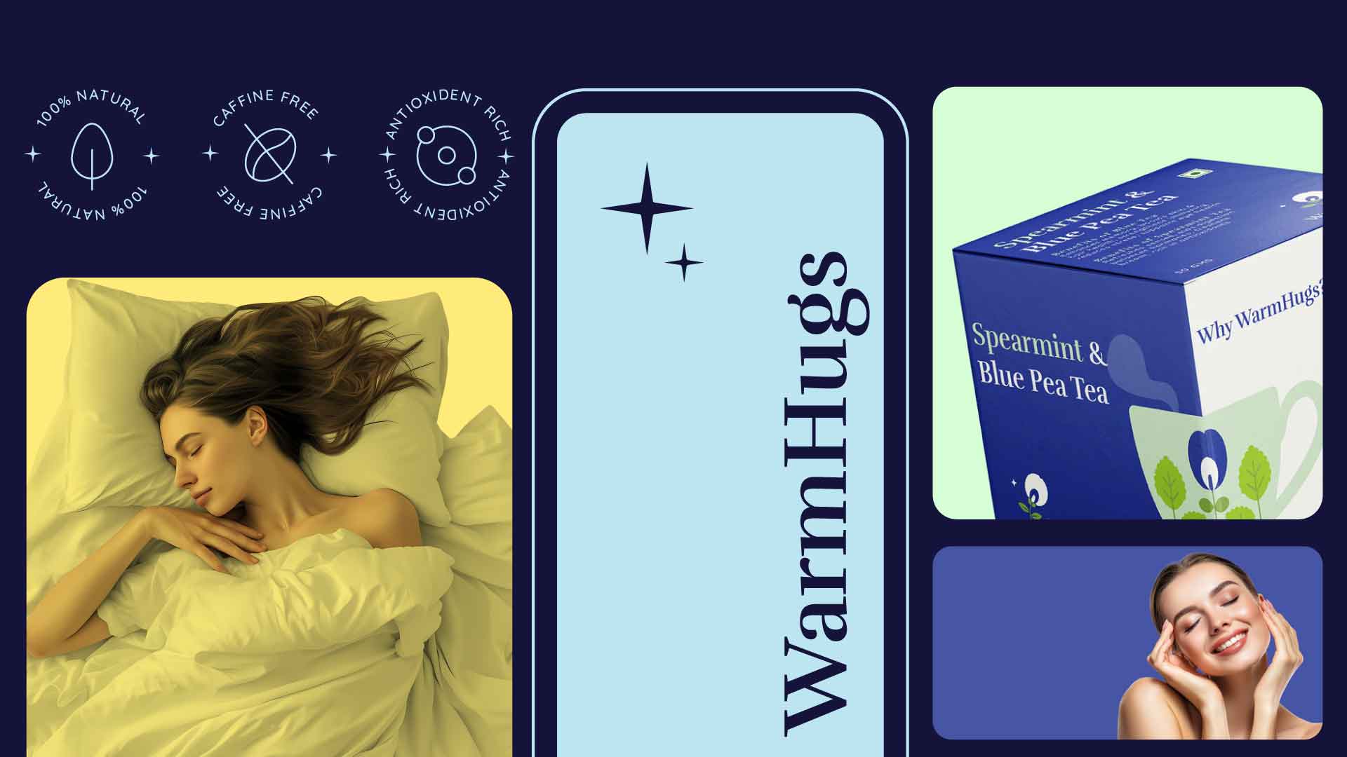
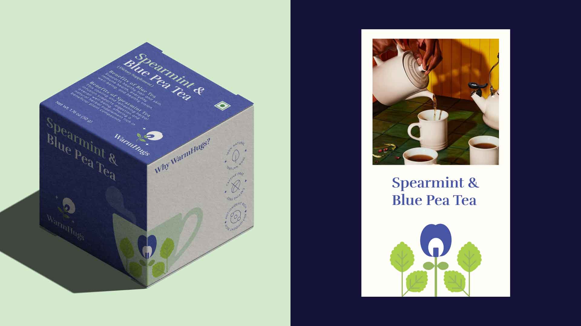
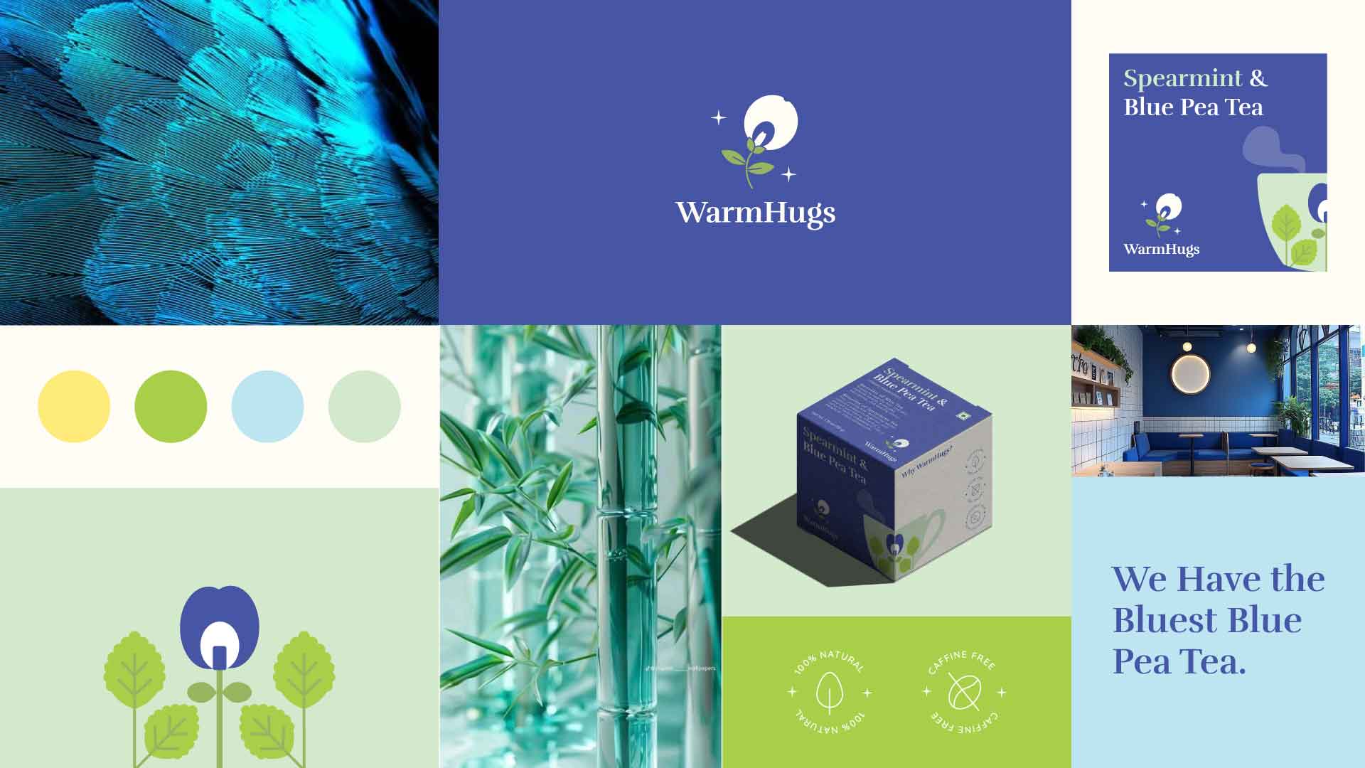
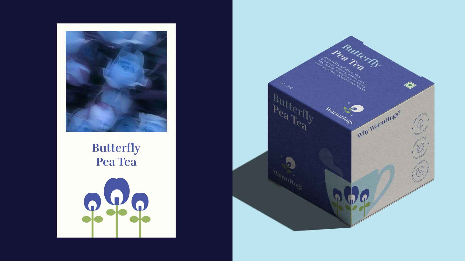
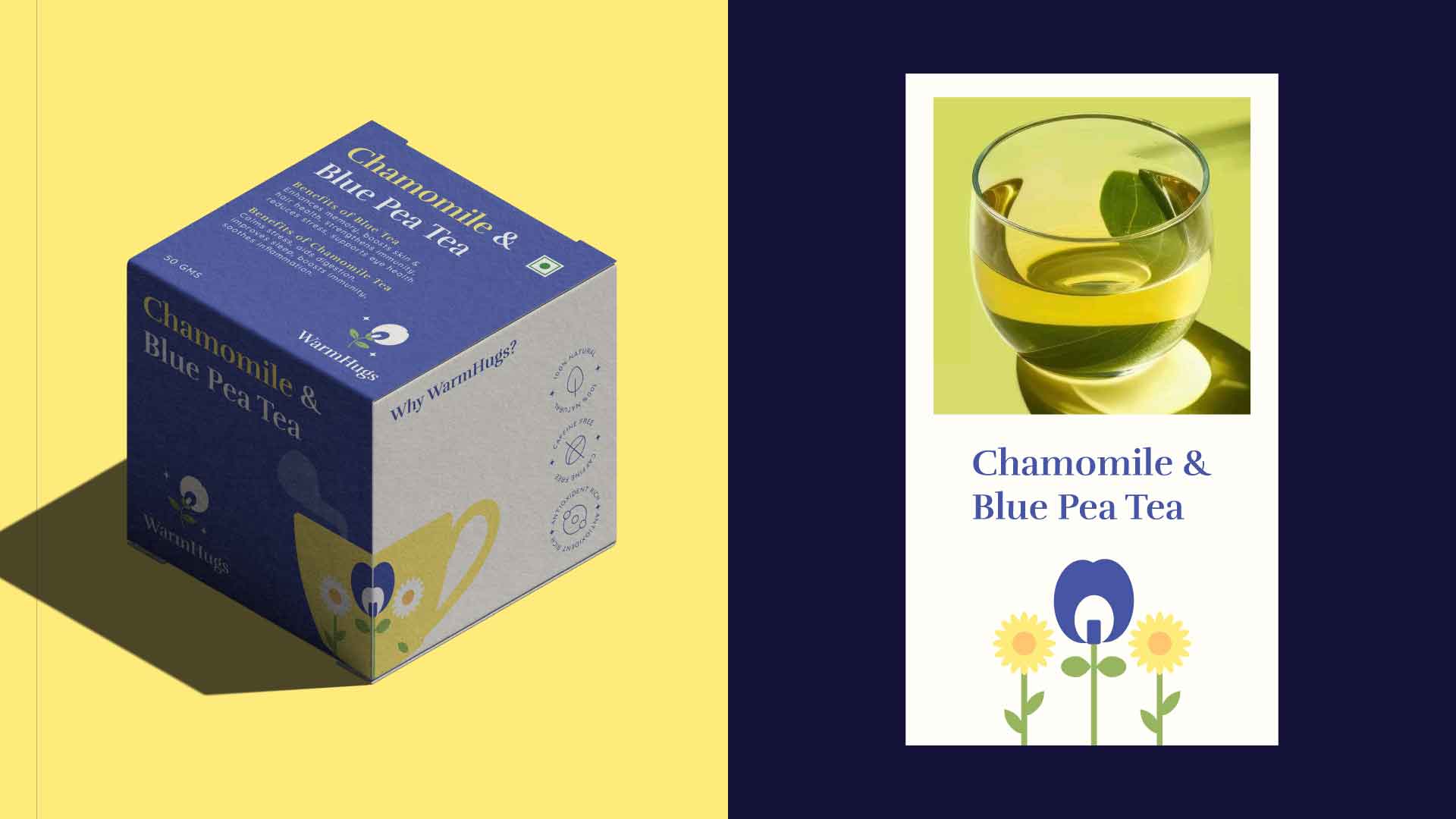
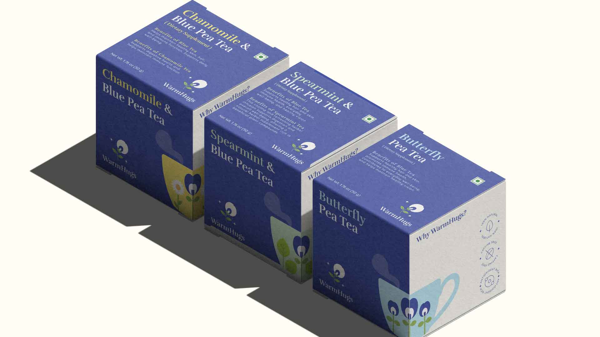
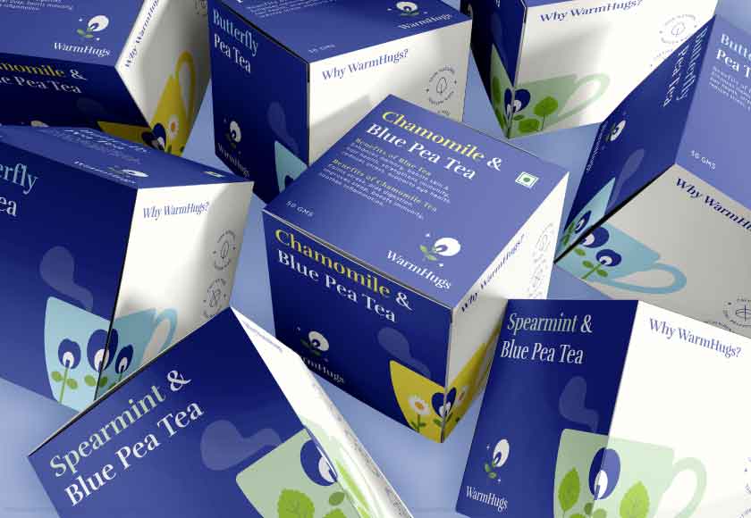
The WarmHugs packaging design is created to reflect calmness, comfort, and a soothing tea experience. Inspired by the idea of relaxation and bedtime rituals, the visual system combines soft, nature-led elements with a clean and minimal aesthetic to communicate purity and ease.
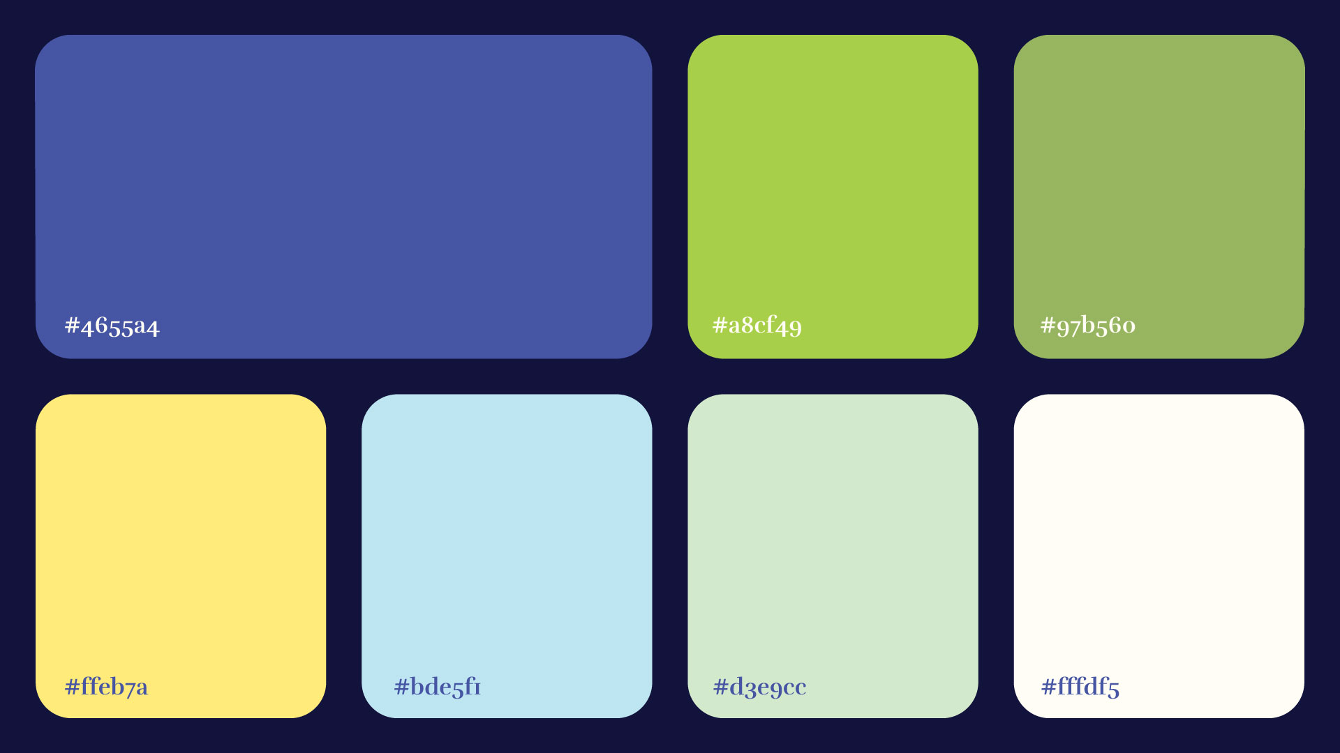
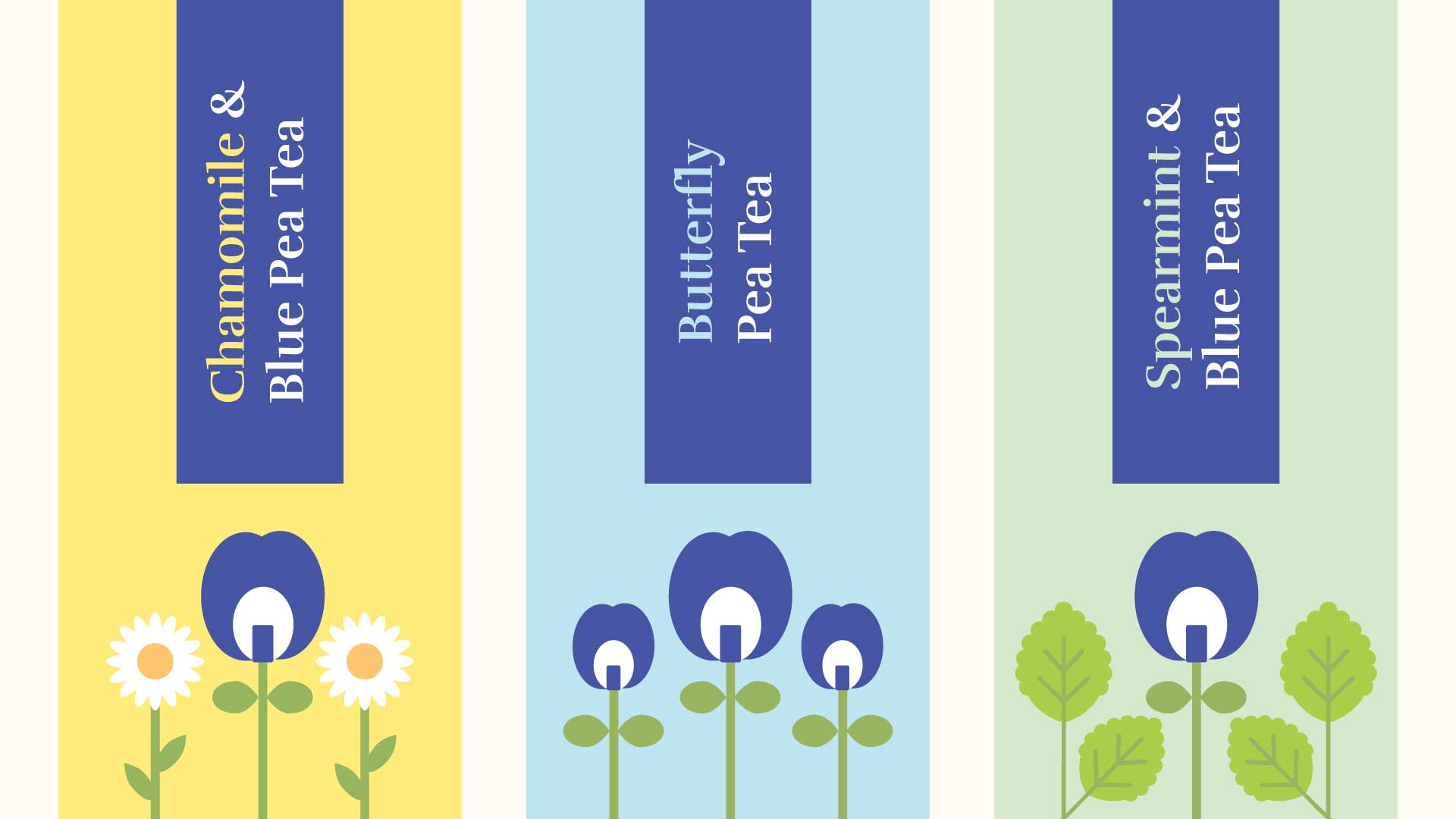
A gentle color palette of greens, blues, and warm neutrals is used to differentiate flavors while maintaining a cohesive and serene brand feel. The floral-inspired illustrations, centered around the blue pea flower and complementary botanicals, add a natural and approachable character to the packaging.
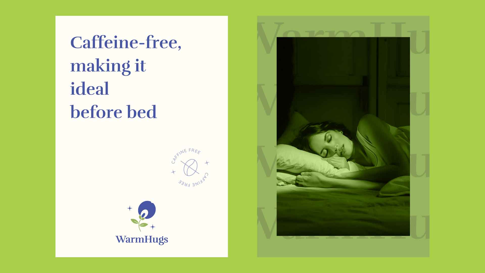
Typography is elegant and understated, allowing the messaging to feel soft yet clear. Statements like “Caffeine-free, making it ideal before bed” reinforce the product’s purpose while aligning with the calming visual tone. Supporting icons and subtle graphic details enhance the sense of authenticity and wellness.
The system extends across multiple variants and formats, maintaining consistency while allowing each flavor to stand out. The result is a packaging experience that feels gentle, trustworthy, and rooted in relaxation, making WarmHugs a comforting presence on the shelf.